The Colorado Palette: Choosing Colors Inspired by the Foothills
When you step outside in the Boulder Foothills, you are immediately surrounded by a masterclass in color theory. The deep pines, the muted sandstone of the Flatirons, the soft sagebrush, and the warm terracottas of our sunsets create a natural palette that is both grounding and breathtaking.
Yet, when many homeowners look inside their houses, they see stark, clinical whites or outdated, muddy grays that feel completely disconnected from the beauty right outside their windows.
As premier home decorators in Boulder, CO, the team at STS Home Staging Boulder Foothills knows that choosing the right color scheme is the foundation of great design. Today, we are sharing our favorite Colorado paint colors and earth tone color palettes to help you bring the serenity of the foothills indoors.
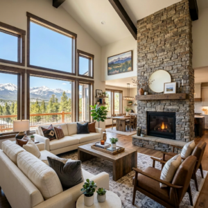
1. The New Neutrals: Warm Creams and Sands
Stark, cool-toned grays have officially left the building—especially here in Colorado. In a climate that sees crisp winter days and snowy nights, cool tones can make a home feel icy and uninviting. Instead, we lean into warm neutrals that capture our abundant sunshine.
- Sandstone Beige: Look for greige or beige tones with warm, yellow, or pink undertones that mimic the local rock formations. They offer a sophisticated, neutral backdrop that makes modern furniture pop.
- Warm Alabaster: If you love a bright, clean look, skip the stark whites and choose a rich, creamy white. It reflects the natural light beautifully without feeling sterile.
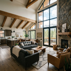
2. Grounding Greens: From Sage to Pine
Green is arguably the easiest color to work with in a foothills home because it acts as a direct extension of the view. Using green in your interior creates a seamless transition between your indoor living space and the outdoors.
- Soft Sage: A muted sage green works incredibly well in bedrooms, home offices, and bathrooms in Evergreen and Golden properties. It is scientifically proven to reduce stress and promote tranquility.
- Deep Forest Pine: For a bold statement, a rich pine or olive green makes for a stunning accent wall, kitchen island color, or powder room backdrop.
3. Terracotta and Rust: Capturing the Sunset
To add warmth and contrast to your neutrals and greens, look to the earthier side of the color wheel. Terracotta, rust, and soft clay colors bring an organic energy into a space.
STS Staging Tip: You don’t necessarily have to paint an entire room terracotta to get the effect. We love introducing these rich, sun-baked tones through leather upholstery, textured throw pillows, or ceramic decor pieces. It adds the perfect touch of warmth to a Mountain Modern design.
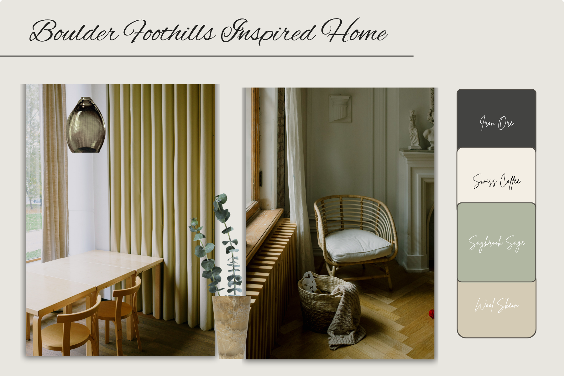
Our Go-To Paint Picks for Foothills Homes
If you are headed to the paint store, here are a few specific, tried-and-true shades from Benjamin Moore and Sherwin-Williams that look spectacular under the unique Colorado light:
| Color Vibe | Paint Name & Brand | Best Used For… |
| The Perfect Warm White | Swiss Coffee (Benjamin Moore) | Main living areas, open-concept spaces |
| The Foothills Greige | Wool Skein (Sherwin-Williams) | Hallways, bedrooms, cozy dens |
| The Serene Green | Saybrook Sage (Benjamin Moore) | Accent walls, cabinetry, bathrooms |
| The Dramatic Focal Point | Iron Ore (Sherwin-Williams) | Fireplace surrounds, window trim, exterior doors |

The Psychological Power of Color in Staging
If you are preparing to sell your home in Longmont, Westminster, or Boulder, your color choices matter more than ever. Color is the first thing a buyer processes when they walk through the door. A thoughtful, cohesive color palette makes a home feel cohesive, expensive, and well-maintained.
On the flip side, bright, highly personalized colors (like a neon kids’ room or a bright red kitchen) can distract buyers and make the home feel smaller. Our goal at STS Home Staging is always to create a neutral canvas that highlights the home’s architecture while allowing buyers to project their own lives onto the space.
Ready to Find Your Perfect Palette?
Whether you are staring at twenty different paint swatches trying to choose the right shade for your living room, or you want to strategically update your home’s aesthetic before hitting the real estate market, we are here to take the guesswork out of the process.
Let the experts at STS Home Staging Boulder Foothills help you design a space you love.
Click here to visit our Contact Us page to schedule your color or staging consultation today!
Missed the previous posts in our series? Catch up here: